

Marion Drapala
Marketing can be described as the “art of persuasion”. Colours play a significant role in this marketing strategy. In fact, colours influence our perception of things, mood, and consumer behaviour, but also evoke different feelings from one person to another. \r\n\r\nYou use them everywhere: flyers, posters, business cards… They define your brand identity. That’s why we’ve put together this article to help you understand the meaning of colours and how to choose and use them effectively.\r\n
The Meaning and Psychological Impact of Colours in Marketing\r\n“According to studies quoted by Neil Patel (ex-Kissmetrics), 85% of people consider colour the main reason for their purchase. Simply changing a product’s colour can boost its sales by more than 80%!” (source: audreytips.com)\r\n
How Colours Influence Marketing\r\nColours enhance your brand’s visual identity and UX (user experience). They draw customer attention, and evoke certain emotions.\r\n\r\nToday, consumers can recognise a brand even without its logo. “Using the right colour can boost brand awareness by as much as 80%” (source: fouineteau.fr). \r\n\r\nPurchase intentions are closely linked to colour. This can greatly increase your conversion rate. \r\n\r\n \r\n\r\nSimply working in a coloured environment can influence how we work. For example, someone might be more creative in a blue space, or more productive in offices with touches of red, etc. (source: video alioze.com)\r\n
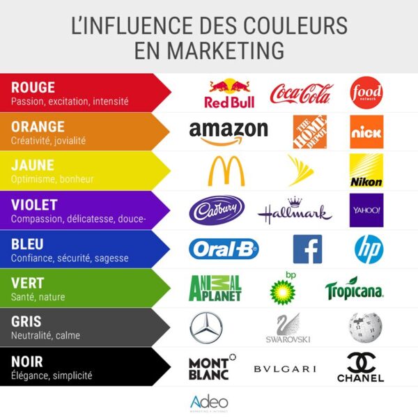
How Colours Are Perceived in Marketing\r\nThis perception isn’t an exact science. Meanings change depending on personal experience, gender, political trends, context, country, and so on. In the end, perception remains subjective.\r\n\r\nBlue symbolises the sky and the sea. This colour evokes reliability and freshness. It offers feelings of calm, trust, safety, peace, and stability.\r\n\r\nHowever, it can give a cold impression. Blue is frequently chosen in health, finance, tech, transport, travel, and so on. For example: PayPal, Facebook.\r\n\r\nRed is highly effective for calls to action. Used strategically, it often triggers impulse purchases. Red is energising, and associated with passion, power, anger, and urgency. It’s also known to stimulate appetite and stands as a symbol of ambition and authority. You’ll encounter it often in energy, food, technology, agriculture… For example: Coca Cola.\r\n\r\nOrange creates a feeling of friendliness and warmth. Orange suggests ambition, enthusiasm, and happiness. It is a popular choice among creative and tech brands. For example: Orange, Amazon.\r\n\r\nYellow is synonymous with sunshine, energy, optimism, warmth, and happiness. Yellow spreads cheerfulness, though it can be tiring on the eyes. Overusing yellow encourages anxiety. You’ll find yellow in food, toy companies… For example: McDonald’s, La Poste, Ikea.\r\n\r\nGreen is ideal for reading. Green brings a feeling of serenity, growth, stability, relaxation, and freshness. It’s often used to refer to nature, organic, or health topics. Green is also a symbol of money and fertility. Sectors like energy and the environment favour it. For example: Starbucks, Aroma-Zone.\r\n\r\nOrganic products: green is key. \r\n\r\n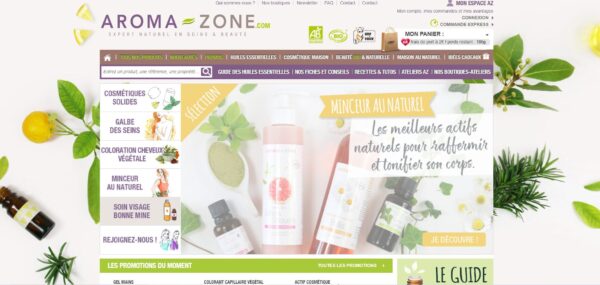 \r\n
\r\n
How to Choose Your Marketing Colours\r\n“Black (34%), blue (30%), and red (30%) are the most widely used” according to Reboot’s research.\r\n\r\nFirst, pick colours based on your target audience. Are you aiming for women, men, an international market…?\r\n\r\nAn international audience won’t interpret colours the same way. You should study local colour perceptions for the countries you wish to expand into. However, you can also use universal colours. \r\n\r\nWhen it comes to colour perception by gender, women are more likely to shop with your brand if you favour soft colours (e.g. blue, purple, green) and are more reluctant to choose grey, brown, or orange (source: alioze.com). \r\n\r\nTo attract a male audience, lean towards blue, green, or black. They’re generally less keen on brown or purple… (source: alioze.com)\r\n\r\nChoose your colours according to your storytelling, and the message you want to convey. The chosen colours will reinforce your brand image. \r\n\r\nFor a harmonious brand guidelines, don’t use more than four colours. They should appear on your logo, website, CTAs (Calls To Action), pop-ups, newsletters, etc. Repeating them is essential for a coherent and well-defined visual identity. \r\n\r\n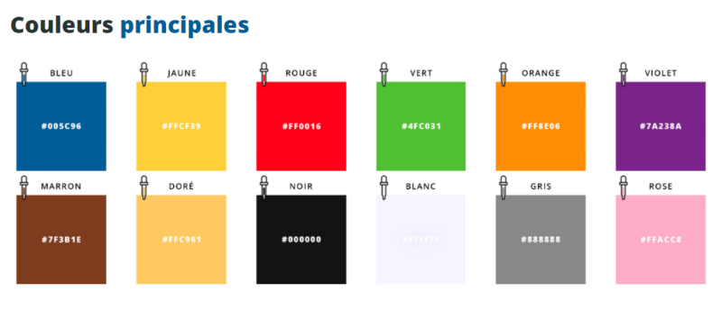 \r\n
\r\n
Source: code-couleur.com \r\nWhen designing your CTAs, remember to make your buttons stand out. As mentioned earlier, orange and red encourage calls to action.\r\n\r\nYour background should be neutral – such as white or black, for example. \r\n\r\nColour choices can also depend on your communications, as well as important sales events or key times of the year. \r\n\r\nFor example: \r\n
\r\n \t
- red / pink for Valentine’s Day\r\n \t
- blue / yellow for summer\r\n \t
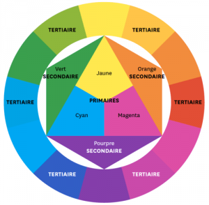
- black for Black Friday\r\n\r\nThere is a colour wheel, commonly used by graphic designers. It can help you combine colours. Shades on opposite sides are often the most complementary.\r\n\r\n
 \r\n
\r\n
Conclusion\r\nColours are essential in shaping your visual identity. They evoke specific emotions, creating an environment that encourages your clients to buy. \r\n\r\nColours reflect your brand and products. As such, colour perception is unique to each individual. However, your choices must be tailored to your audience, storytelling, and message. And always, combine the right colours (two to four) for a more harmonious effect.
\r\n\r\nSimply working in a coloured environment can influence how we work. For example, someone might be more creative in a blue space, or more productive in offices with touches of red, etc. (source: video alioze.com)\r\n
How Colours Are Perceived in Marketing\r\nThis perception isn’t an exact science. Meanings change depending on personal experience, gender, political trends, context, country, and so on. In the end, perception remains subjective.\r\n\r\nBlue symbolises the sky and the sea. This colour evokes reliability and freshness. It offers feelings of calm, trust, safety, peace, and stability.\r\n\r\nHowever, it can give a cold impression. Blue is frequently chosen in health, finance, tech, transport, travel, and so on. For example: PayPal, Facebook.\r\n\r\nRed is highly effective for calls to action. Used strategically, it often triggers impulse purchases. Red is energising, and associated with passion, power, anger, and urgency. It’s also known to stimulate appetite and stands as a symbol of ambition and authority. You’ll encounter it often in energy, food, technology, agriculture… For example: Coca Cola.\r\n\r\nOrange creates a feeling of friendliness and warmth. Orange suggests ambition, enthusiasm, and happiness. It is a popular choice among creative and tech brands. For example: Orange, Amazon.\r\n\r\nYellow is synonymous with sunshine, energy, optimism, warmth, and happiness. Yellow spreads cheerfulness, though it can be tiring on the eyes. Overusing yellow encourages anxiety. You’ll find yellow in food, toy companies… For example: McDonald’s, La Poste, Ikea.\r\n\r\nGreen is ideal for reading. Green brings a feeling of serenity, growth, stability, relaxation, and freshness. It’s often used to refer to nature, organic, or health topics. Green is also a symbol of money and fertility. Sectors like energy and the environment favour it. For example: Starbucks, Aroma-Zone.\r\n\r\nOrganic products: green is key. \r\n\r\n\r\n
How to Choose Your Marketing Colours\r\n“Black (34%), blue (30%), and red (30%) are the most widely used” according to Reboot’s research.\r\n\r\nFirst, pick colours based on your target audience. Are you aiming for women, men, an international market…?\r\n\r\nAn international audience won’t interpret colours the same way. You should study local colour perceptions for the countries you wish to expand into. However, you can also use universal colours. \r\n\r\nWhen it comes to colour perception by gender, women are more likely to shop with your brand if you favour soft colours (e.g. blue, purple, green) and are more reluctant to choose grey, brown, or orange (source: alioze.com). \r\n\r\nTo attract a male audience, lean towards blue, green, or black. They’re generally less keen on brown or purple… (source: alioze.com)\r\n\r\nChoose your colours according to your storytelling, and the message you want to convey. The chosen colours will reinforce your brand image. \r\n\r\nFor a harmonious brand guidelines, don’t use more than four colours. They should appear on your logo, website, CTAs (Calls To Action), pop-ups, newsletters, etc. Repeating them is essential for a coherent and well-defined visual identity. \r\n\r\n\r\n
Source: code-couleur.com \r\nWhen designing your CTAs, remember to make your buttons stand out. As mentioned earlier, orange and red encourage calls to action.\r\n\r\nYour background should be neutral – such as white or black, for example. \r\n\r\nColour choices can also depend on your communications, as well as important sales events or key times of the year. \r\n\r\nFor example: \r\n
\r\n \t
- red / pink for Valentine’s Day\r\n \t
- blue / yellow for summer\r\n \t
- black for Black Friday\r\n\r\nThere is a colour wheel, commonly used by graphic designers. It can help you combine colours. Shades on opposite sides are often the most complementary.\r\n\r\n\r\n
Conclusion\r\nColours are essential in shaping your visual identity. They evoke specific emotions, creating an environment that encourages your clients to buy. \r\n\r\nColours reflect your brand and products. As such, colour perception is unique to each individual. However, your choices must be tailored to your audience, storytelling, and message. And always, combine the right colours (two to four) for a more harmonious effect.
 \r\n\r\n
Source: code-couleur.com \r\nWhen designing your CTAs, remember to make your buttons stand out. As mentioned earlier, orange and red encourage calls to action.\r\n\r\nYour background should be neutral – such as white or black, for example. \r\n\r\nColour choices can also depend on your communications, as well as important sales events or key times of the year. \r\n\r\nFor example: \r\n
- \r\n \t
- red / pink for Valentine’s Day\r\n \t
- blue / yellow for summer\r\n \t
- black for Black Friday\r\n\r\nThere is a colour wheel, commonly used by graphic designers. It can help you combine colours. Shades on opposite sides are often the most complementary.\r\n\r\n
\r\n
Conclusion\r\nColours are essential in shaping your visual identity. They evoke specific emotions, creating an environment that encourages your clients to buy. \r\n\r\nColours reflect your brand and products. As such, colour perception is unique to each individual. However, your choices must be tailored to your audience, storytelling, and message. And always, combine the right colours (two to four) for a more harmonious effect.
- blue / yellow for summer\r\n \t
Related Articles
Increasing your average basket value is one of the most [...]

Emailing is an exceptionally powerful marketing tool for every stage [...]